UX/UI Design
E-learning Platform
Design of a learning management system focused on usability, clarity and efficient study flow.

UX/UI Design
Design of a learning management system focused on usability, clarity and efficient study flow.
✓ Complex and confusing navigation
✓ Lack of clear learning structure
✓ Difficult access to materials
✓ Low engagement during learning
✓ Inconsistent interface elements


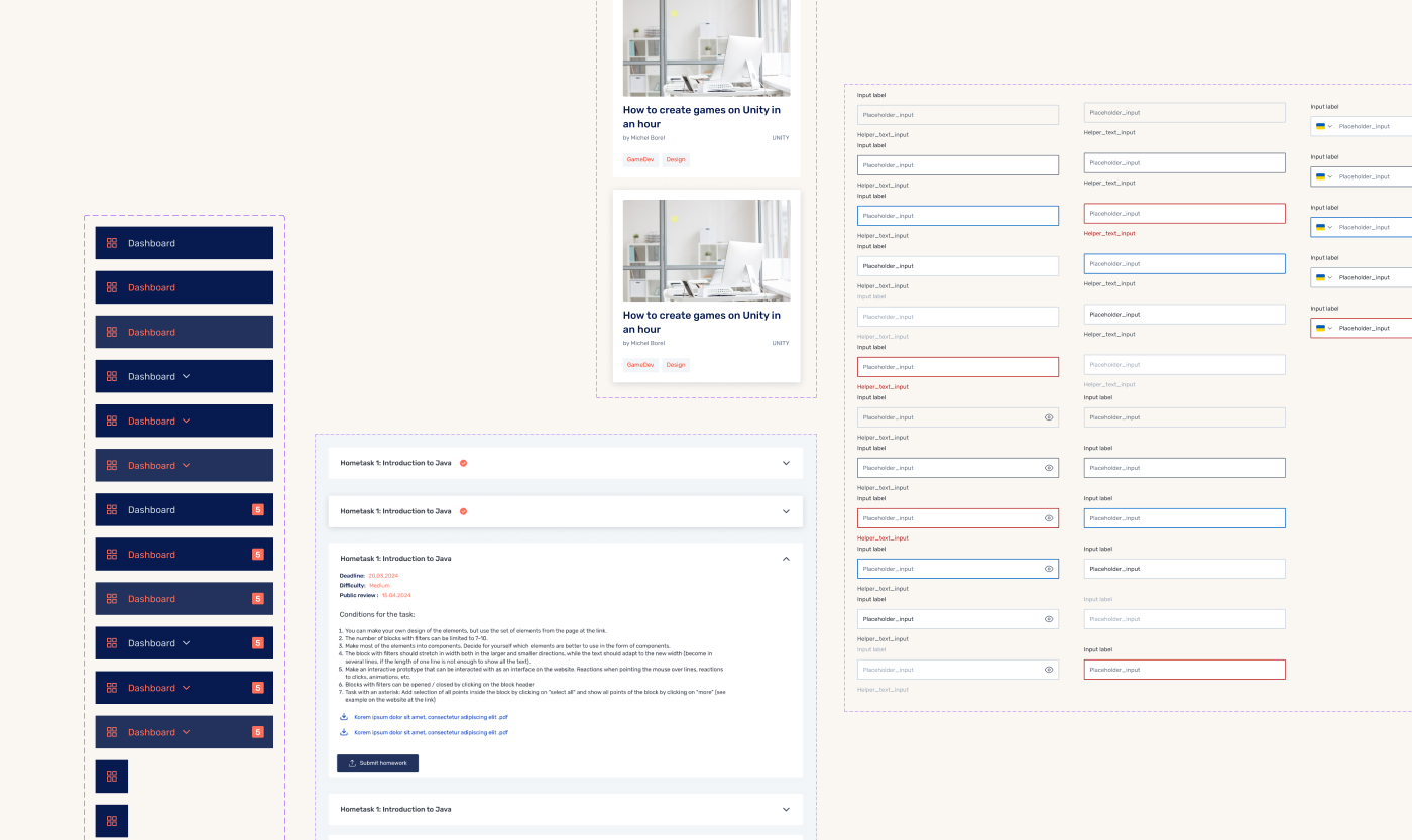
✓ quick access to courses
✓ structured content
✓ clear navigation
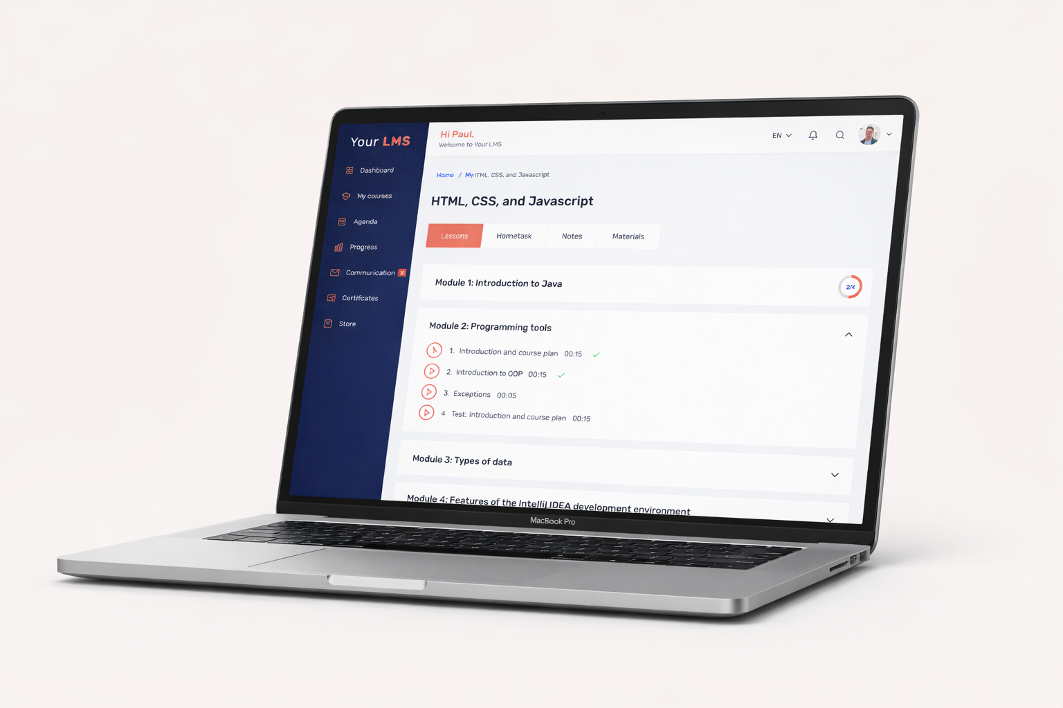
The course interface is organized into clear tabs — modules, homework, materials and notes — allowing easy switching between sections.
A built-in progress chart helps students track their learning and stay engaged.
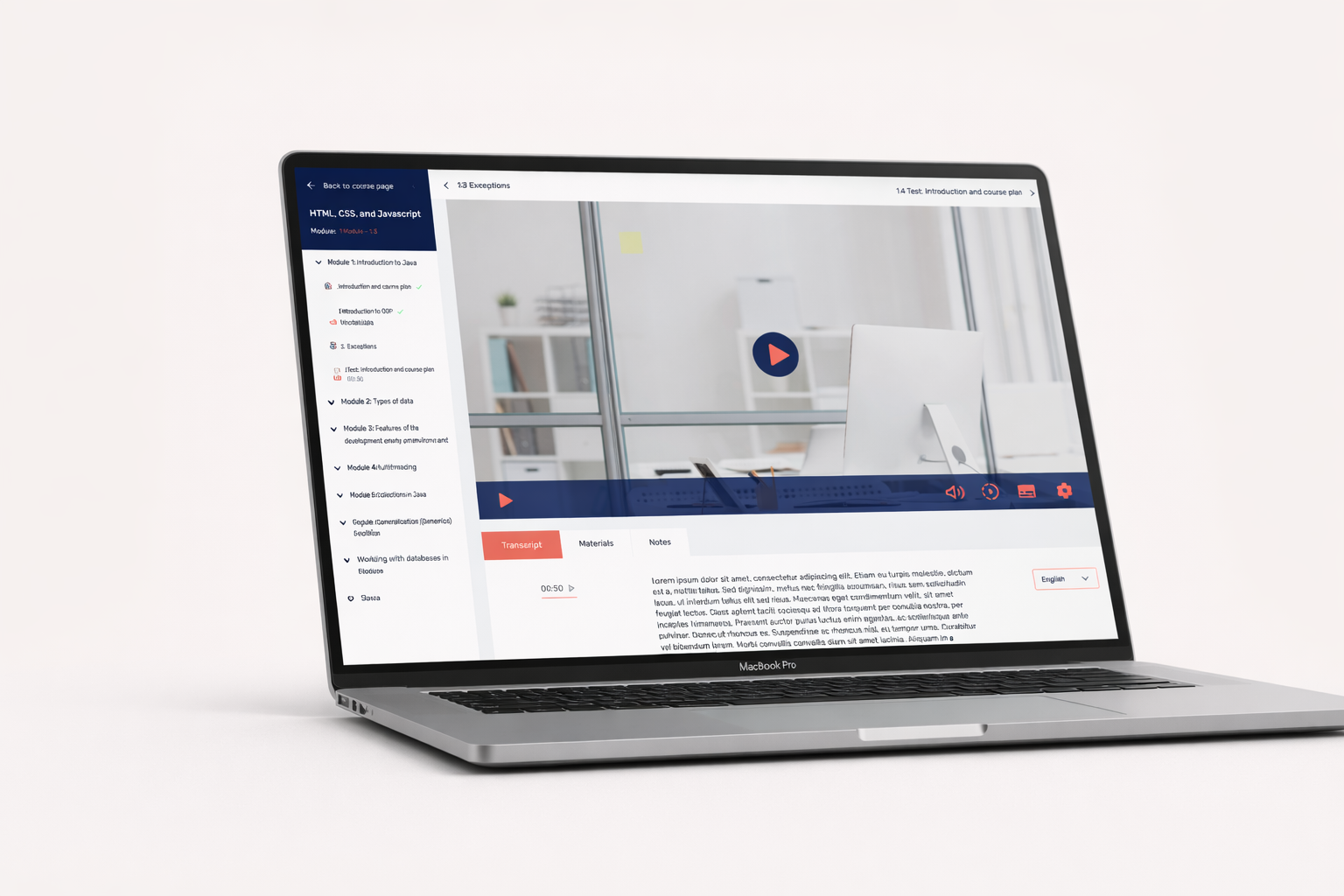
Each lesson includes navigation between modules and lessons for a smooth learning flow.
Below the video, students can access transcription with language options, save notes and download materials.
The earlier version contained more visual intensity and a less structured content layout, which made the dashboard harder to scan and navigate.
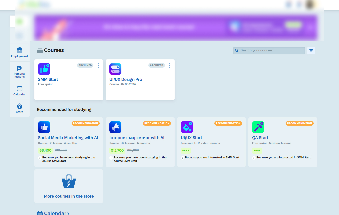

The redesign focused on improving structure, readability and course discovery.
The updated interface introduces clearer hierarchy, calmer visual rhythm and more relevant content blocks.